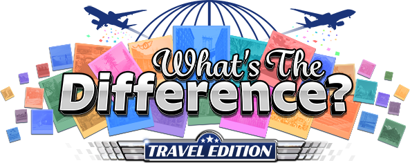
What’s the Difference? is a casino game developed for GameCo, LLC. With most smaller-sized startups, artists are often asked to wear a variety of different hats. That was the case on this project, as I contributed everything from logo and UI design to 3D environments.
Since this work represents a design concept as opposed to a finished game, I decided to show my approach to artistic development and the thought process behind it.
Below are examples of my contributions to the title.
Please click an image to enlarge.
Early Logo Concepts - What’s the Difference? was a new IP that we were creating, so my first step in the creative process was to establish a brand identity. It was designed as a hidden object game for casinos, so we wanted something vibrant and eye-catching to compete for attention on a busy floor.
The basic premise is that you’re a traveler vacationing around the globe. The player spots differences in photographs of different locations, then places a wager based on their proficiency at doing so. Pretty straightforward.
The team wanted to incorporate themes of travel and mystery into the early designs. When creating a logo, I always try to create a strong silhouette, giving the design a distinct and easily recognizable shape, even when reduced to smaller sizes.
The deco-inspired version on top was my first attempt. While it did help establish an overall style, it ultimately felt a bit too Sherlock Holmes/ Victorian, and we wanted something more contemporary.
The middle version was an attempt to increase the scale and scope by giving it more of a global feel. The team liked the imagery of planes circling the globe and a version of this made it into the final design.
The third iteration was based on classic movie marqees. I envisioned it in the game with animated flashing lights around the sign. I liked this concept, but it still didn’t quite match the style that we were looking for. We ultimately decided to try one with a photographic element.
Here’s my final, approved version. The branding was slightly changed, as “Around the World” became “Travel Edition”. I received strong feedback on the pilot wing motif for the Travel Edition branding, so it made another guest appearance later in the UI. The colored photos really added some vibrancy and pop to the design. Most of the images in the photos came from vacation pics in my phone.
With the logo out of the way, my next task was to develop UI elements in order to establish an overall style. Since there were a relatively small number of locations in the game, I thought it might be fun to give each one its own bit of flair.
I created a quick mockup with the idea of tailoring certain UI elements to its corresponding geography. For example, when visiting the European location, the UI could be bordered with a Celtic pattern.
We ultimately put this idea on the back burner due to time constraints and the amount of additional UI work that it would take to implement.
In a callback to the deco design that I used earlier with the logo, I made another attempt at infusing that style into my UI concept. It turned out clean and readable and I think that it does a good job of toeing the line between classic and contemporary.
Since the team was receptive to the pilot wings in the logo, they wanted to see something similar with the Progressive button.
Most of the shapes from these concepts were inspired by WW2 American pilot designs. I had a blast designing them and I especially liked how the shapes played nicely with the deco-inspired UI elements that I created previously.
As the pieces came together, it started feeling more like a cohesive vision rather than a collection of individual ideas. At this point, subsequent concepts became easier to create since the groundwork was in place regarding palette choice, typography and design aesthetic.
It felt like we were in a good place with the UI, so next up was to conceptualize 3D environments for various locations in the game.
It may seem like a stretch to work on product branding, switch gears to UI, then again to 3D game environments, but the diversity of work kept me engaged and helped keep my ideas fresh. Having a broad skill set also allows me to make a larger contribution to a project, so I’m always on the lookout for ways to diversify my art and add new tools to my arsenal.
Once I gathered enough reference material, I dove into 3D Studio Max and began mocking up an Egyptian cafe scene. The team liked the idea of each location being casual and touristy, like a coffee shop or eatery. We decided to create foreground imagery in 3D, then composite it into a background photograph.
The biggest challenge was matching the lighting of the 3D models to the photographic backgrounds. An additional challenge was the shape of the game cabinet. Since it was tall and narrow, it took some finessing in order to capture the perfect shot.
Unfortunately, at this point our progress was halted due to Covid-19. I’m still very proud of what we accomplished and had a wonderful time contributing to its development.
